
Brief
Empire need a logo to represent their brand as a manufacturing company. Dipping powder is a fairly new way to do manicures. This brand’s intention is to make products for private label companies to resell and not visible to the end user; unless requested.
Challenge
It was a start for the new company with a fresh design. The original idea for the logo is to have a modern look to represent the dipping powder manufacture.
Goal
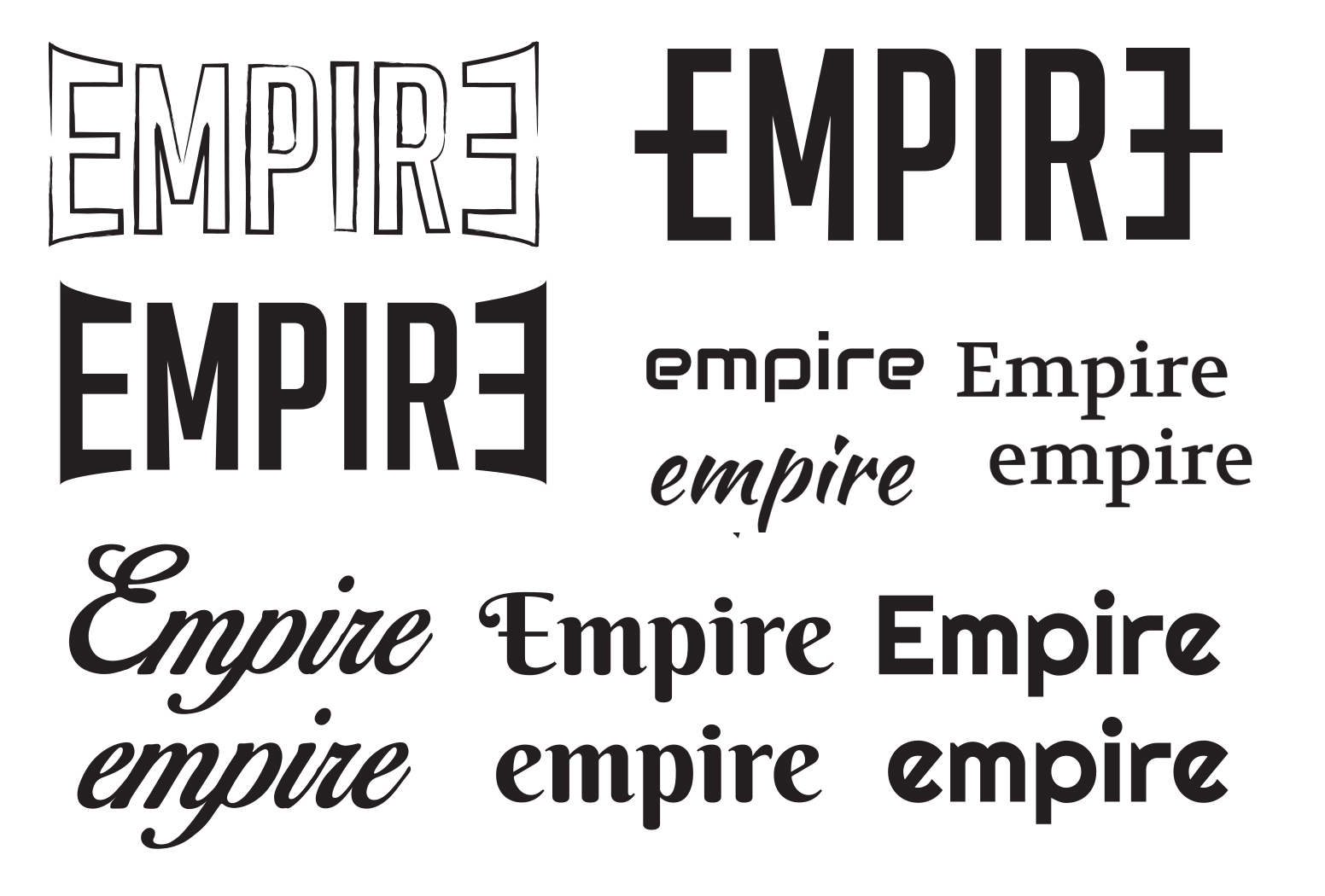
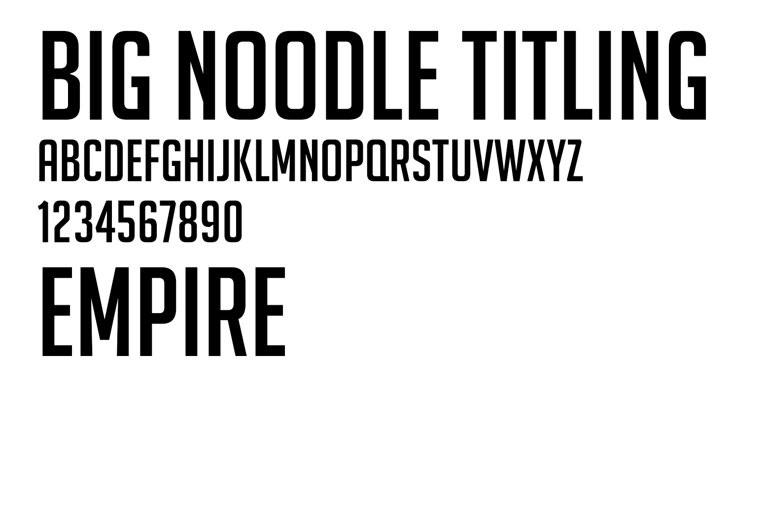
After going through a couple of stylescapes. The font that stood out the most is Big Noodle Titling. The clients gave us a goal to give an alternative look to the same font that can also implement a hidden message of clarity and/or emphasis.

Final Logo
With the goal in mind, a vision for the logo took shape. The two capital E's, forward and reverse, act as brackets. Brackets are used for highlighting importance editorials in a quote. Because Empire is a company that manufacture products for various brands, it is hidden to the end user unless it is exposed. The best example to explain this is "Brand A's product is so superior because of the state of the art dipping powder manufacture [Empire]." The strikethrough on the E's represents that the text is not meant for inclusion and only to be seen by the private label brands.
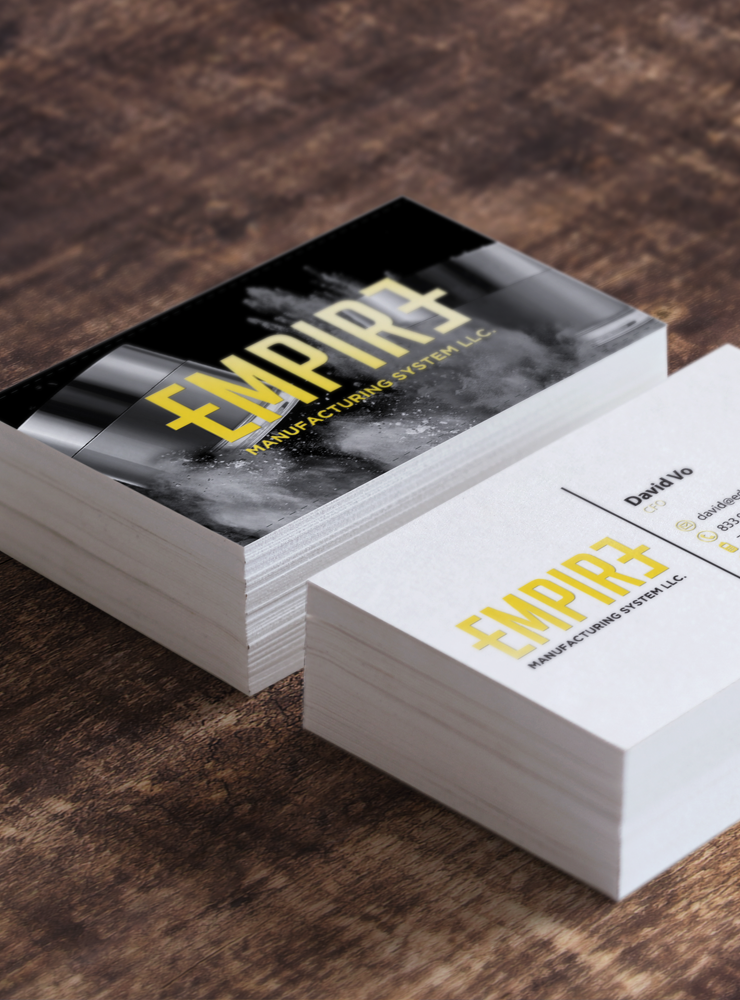
Gold foiled premium business cards.
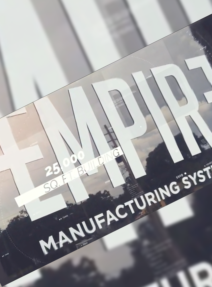
Scalable logo for window placement.
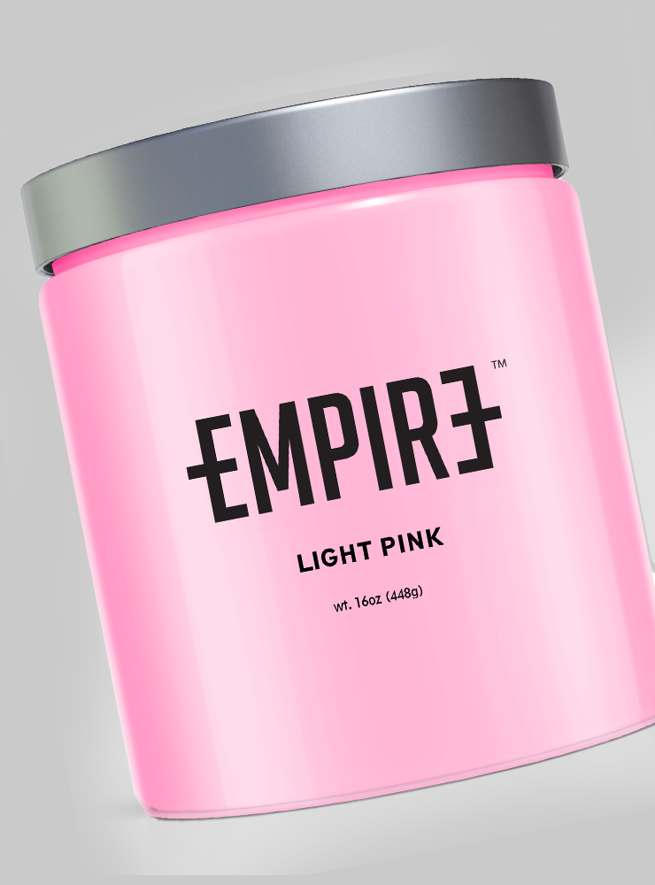
Ready for private labeling.
Selected Works

StickerPrintGoBranding Design
The ConduitBranding Design
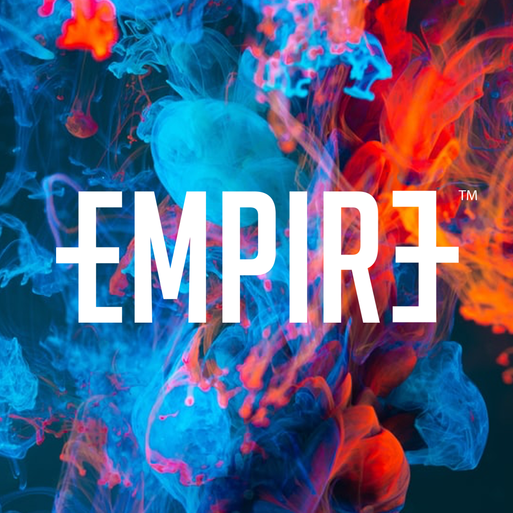
Empire Manufacturing LogoLogo Design
League of Women VotersLogo Design
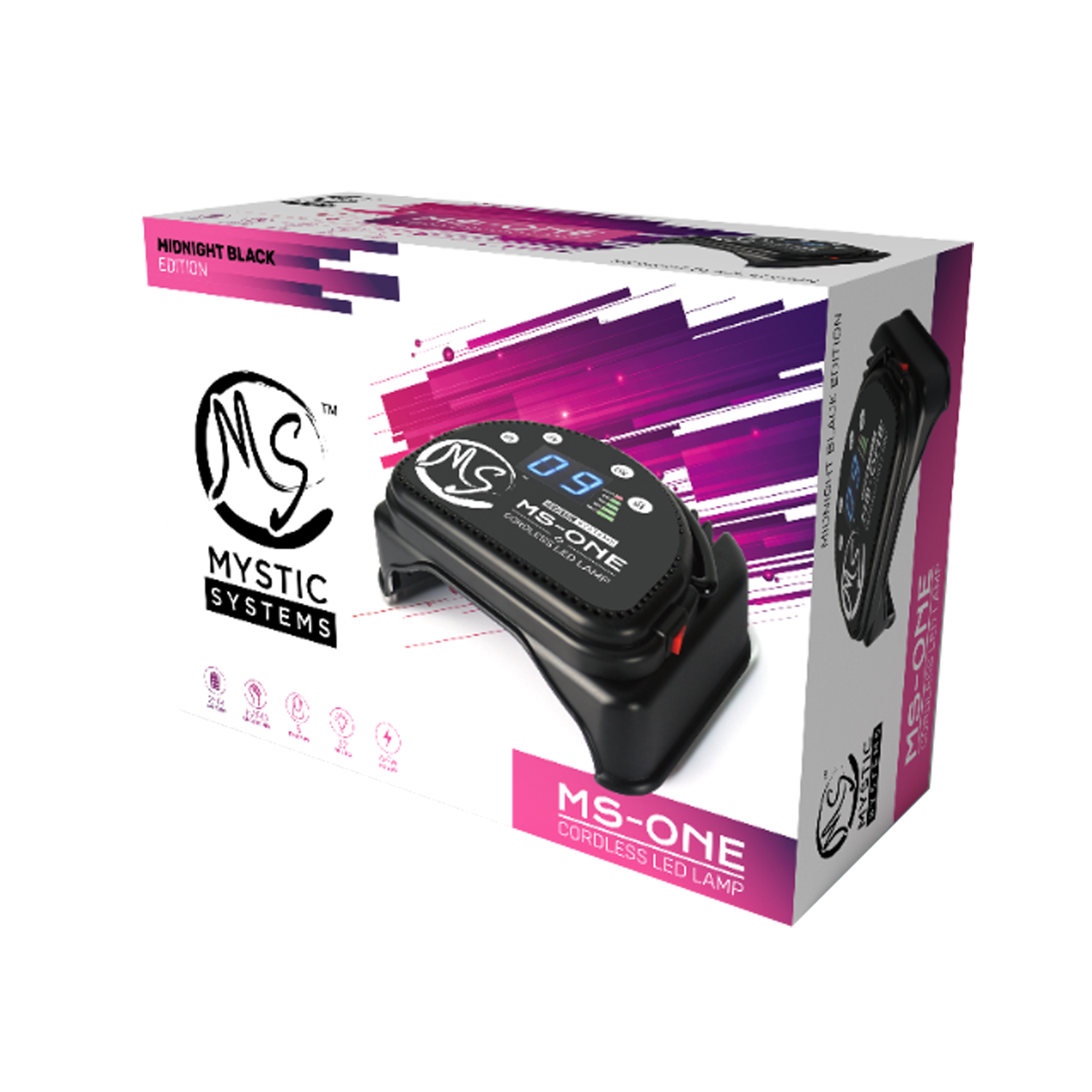
MS Professional LED LampUX UI Design
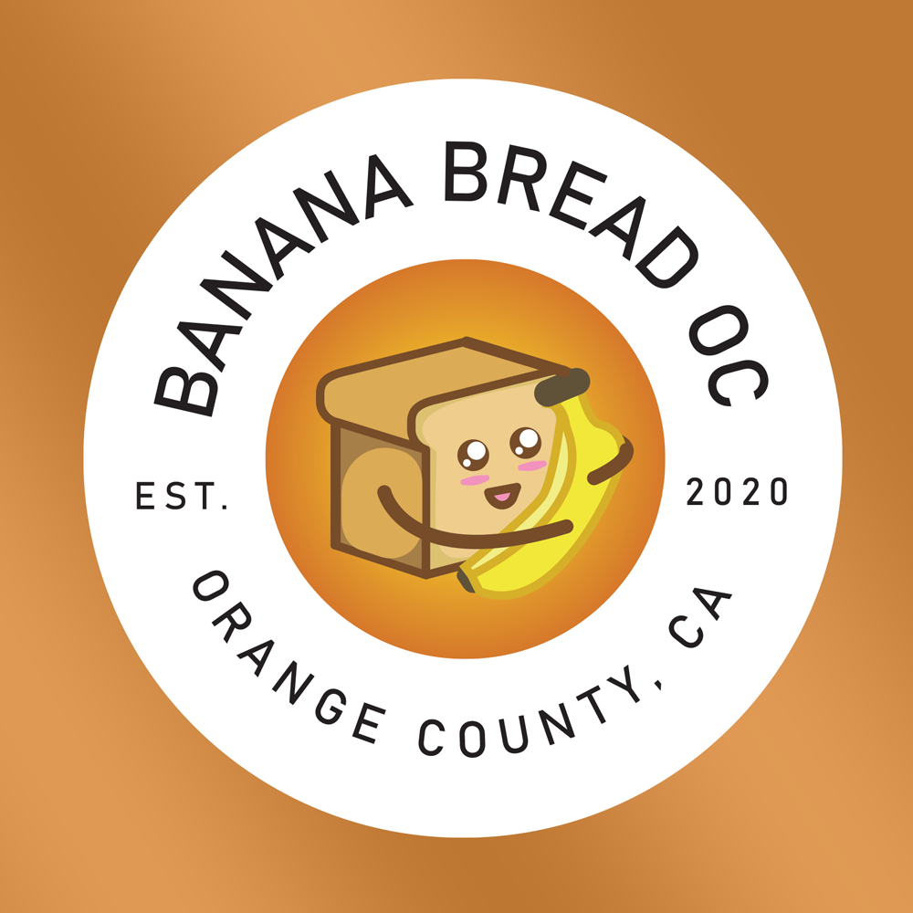
Banana Bread OCLogo Redesign
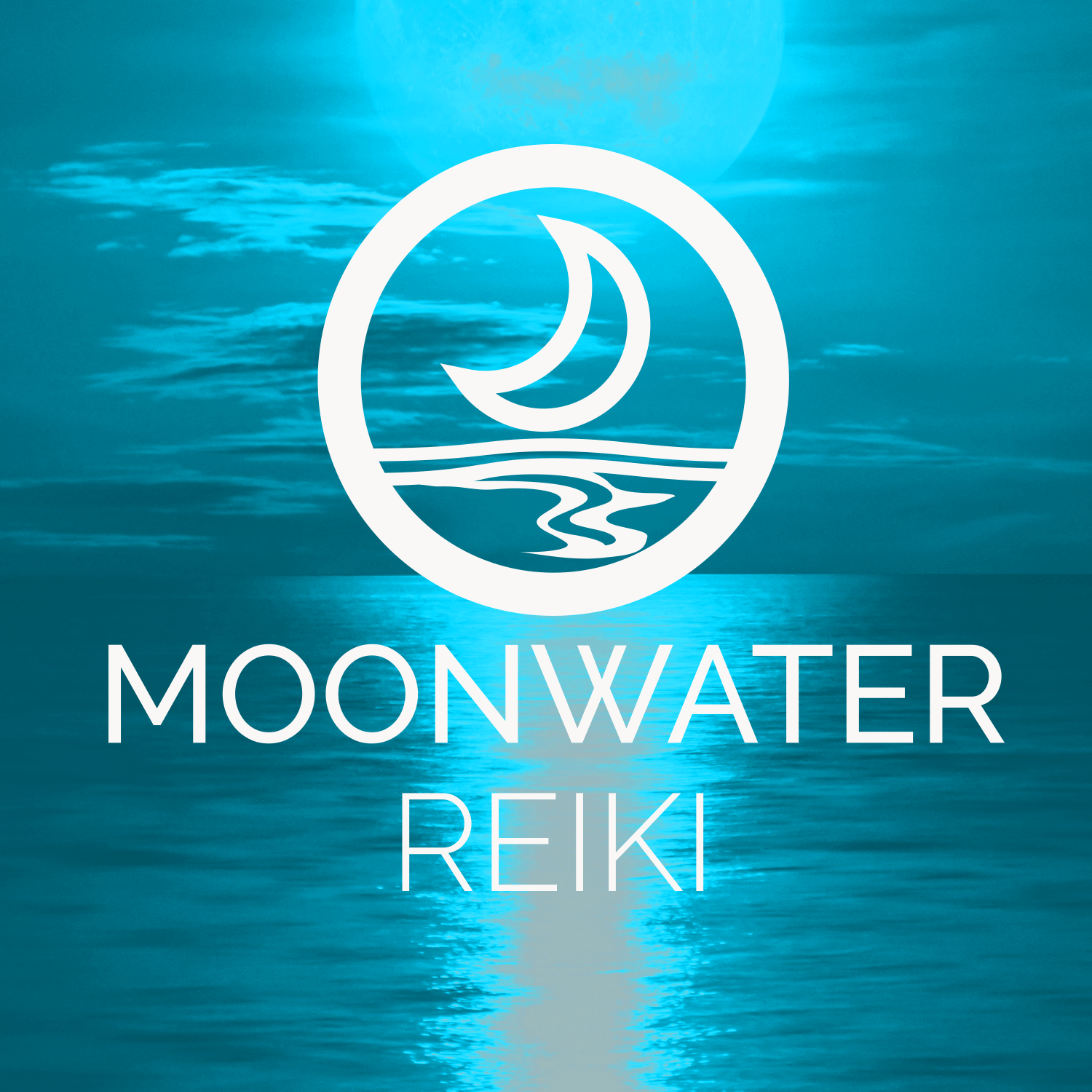
Moonwater ReikiLogo Design
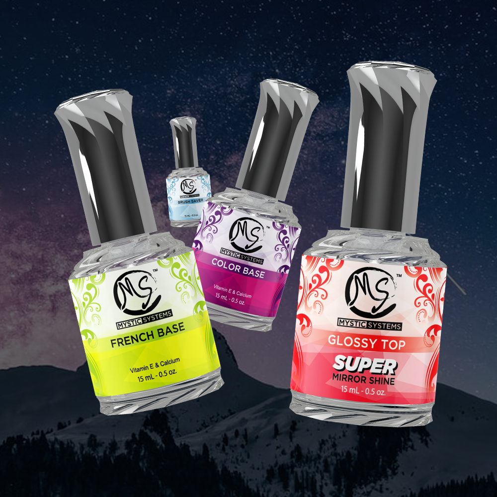
Gel Liquid BottlesUI/UX Design
Formula DriftVideo Production