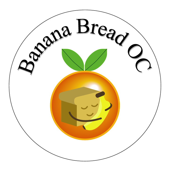
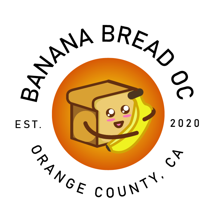
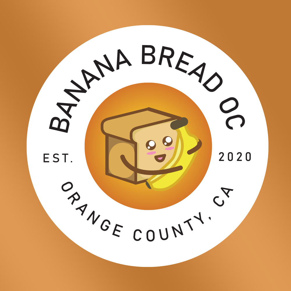
This is a logo redesign for a local banana bread baker in Orange County, California. Their original logo was created by the founders. Anton made a rendition of what their logo would look like with a refined and modern FUN take.
BRIEF
Their brand of vision is to create a fun family vibe to share the enjoyment of Banana Bread. Freshly homemade banana bread is moist and ready to eat! The logo design should incorporate their love of bananas and bread. Iconic characters for the logo should represent the brand is a focal point of grabbing the customers attention to a memorable warm welcome at first glance.
Challenge
Finding the balance of refinement and not butchering the original design is the big challenge in this design. It is important to keep the original idea and aspects of the logo.
Keeping the familiar design and layout will let the customer know that it is the same brand, just with a more serious new update on the logo.
Move the cursor below to see before and after.
Goal
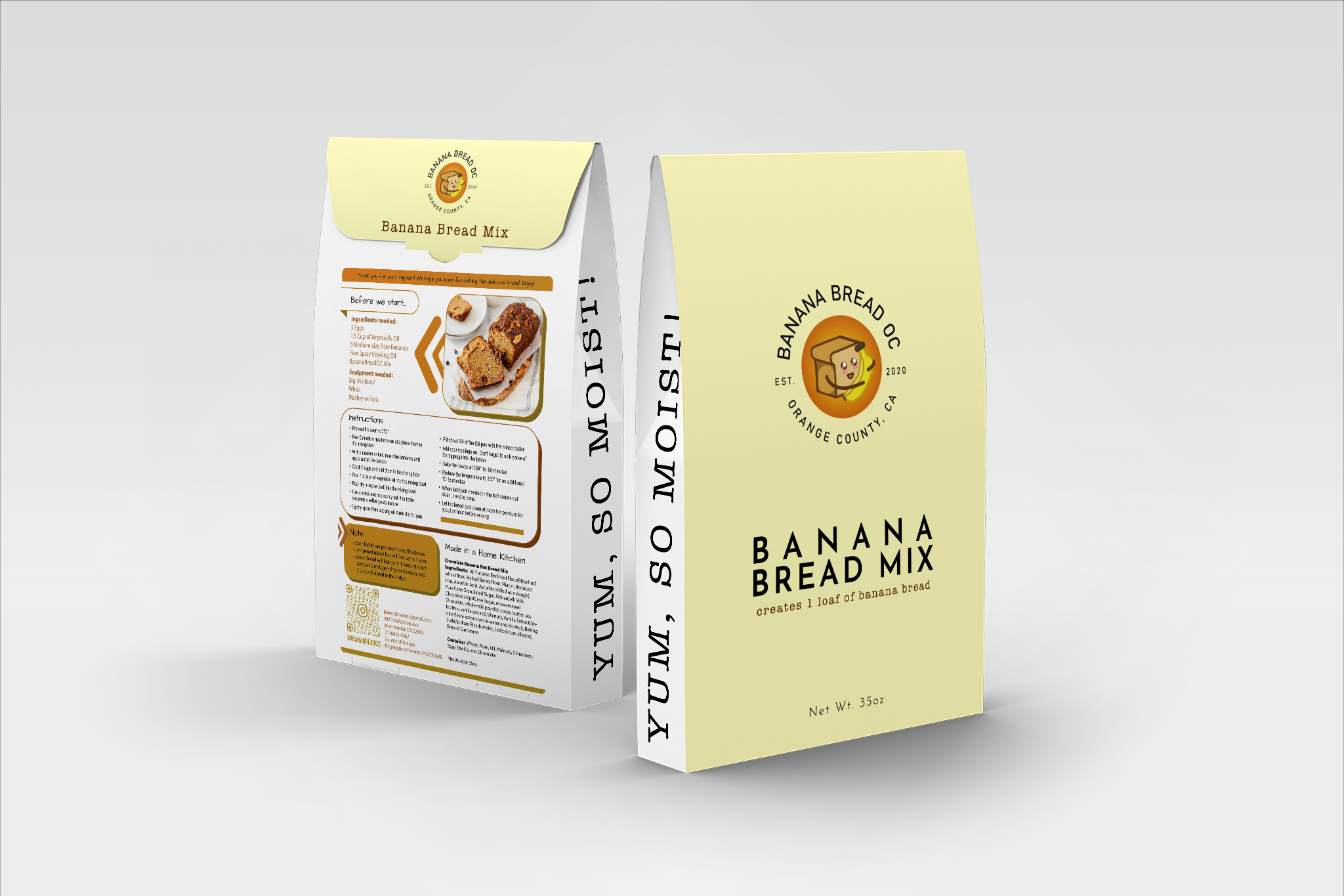
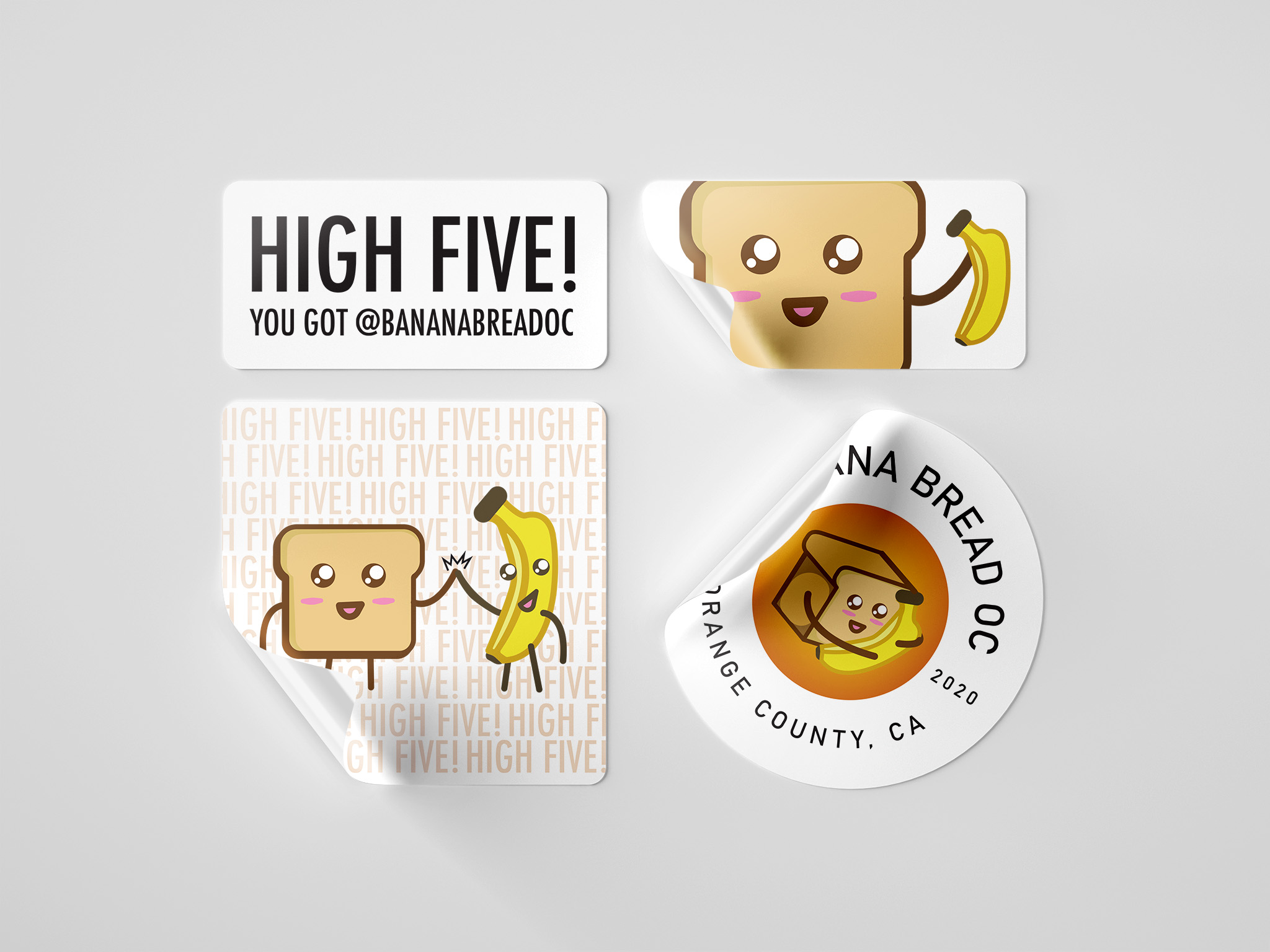
Being able to have a logo that can be used and scaled on various mediums is the mission. The end product are premixed ingredients in a pouch, labels, stickers and social media.
End
Selected Works

StickerPrintGoBranding Design

The ConduitBranding Design

Empire Manufacturing LogoLogo Design
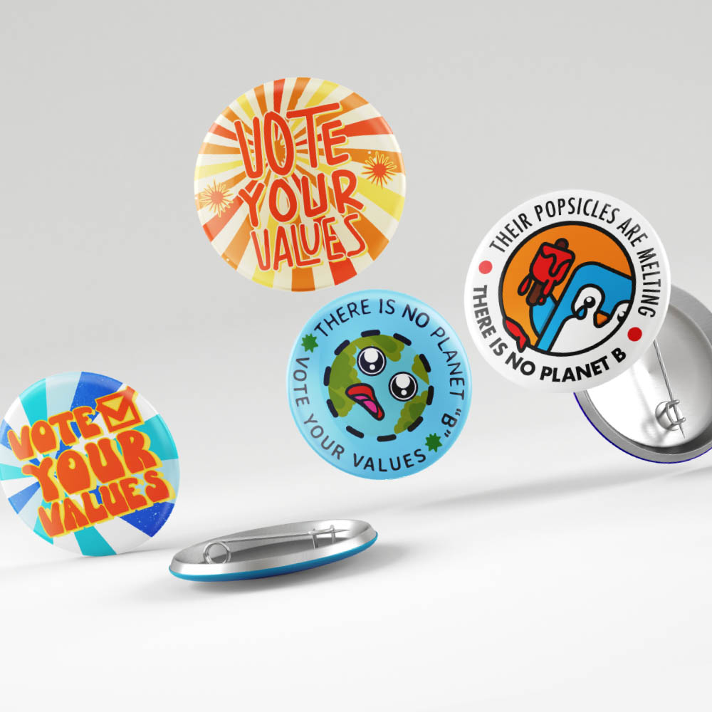
League of Women VotersLogo Design
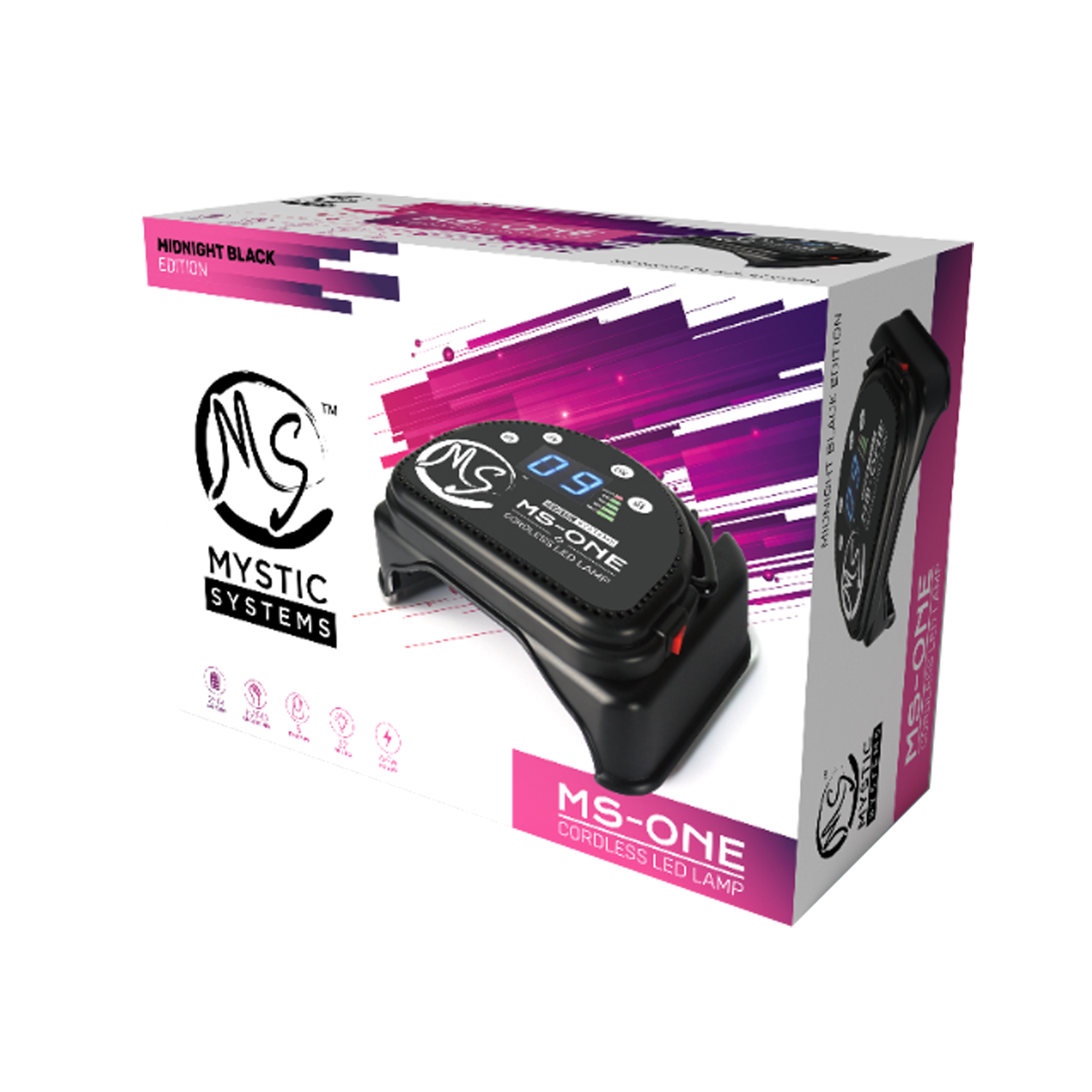
MS Professional LED LampUX UI Design
Banana Bread OCLogo Redesign
Moonwater ReikiLogo Design
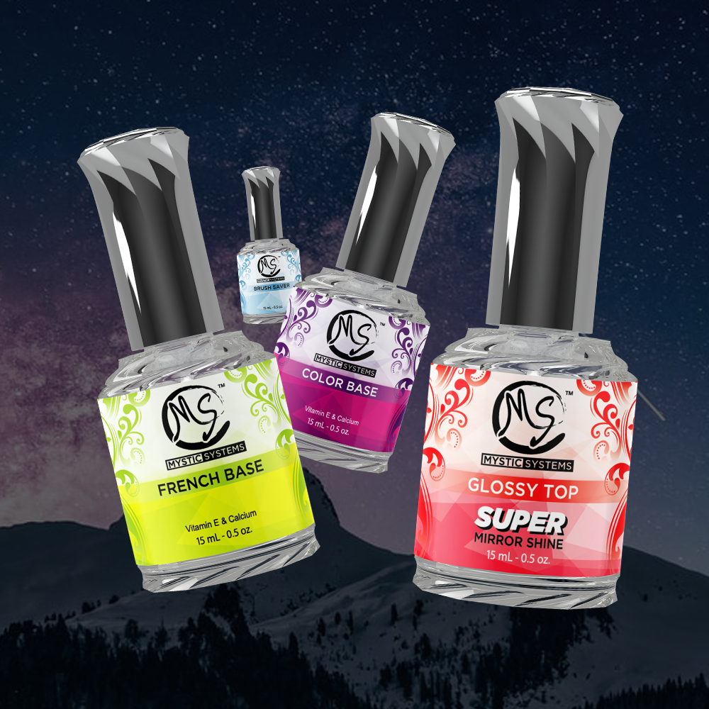
Gel Liquid BottlesUI/UX Design
Formula DriftVideo Production