Logo Design
Empire Manufacturing Logo

PROJECT OVERVIEW
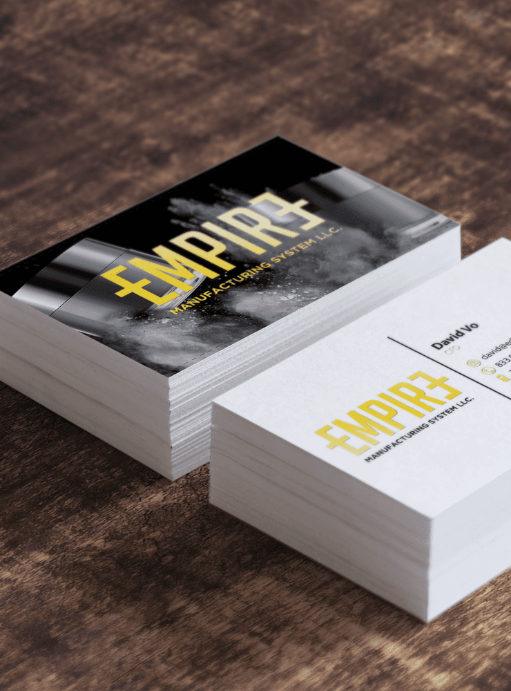
Empire Manufacturing is a logo system for a private-label dipping-powder manufacturer. The final mark uses mirrored capital E forms as brackets, subtly framing the company’s role behind the brands it supports.
CASE STUDY
BRIEF Empire needed a logo to represent its role as a private-label dipping-powder manufacturer. The identity needed to feel modern while remaining discreet behind the brands it supports. CHALLENGE The task was to create a fresh mark for an emerging manufacturer and find a way to build clarity and emphasis into the logo itself. FINAL LOGO Two capital E forms—one forward and one reversed—act as brackets. The bracket metaphor reflects Empire’s behind-the-scenes role: visible to private-label partners, but usually absent from the end customer’s view. The interrupted E forms reinforce that selective visibility. APPLICATIONS The final system was prepared for gold-foiled business cards, window graphics, and flexible private-label use.
SELECTED VISUALS